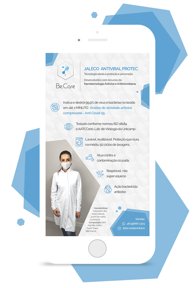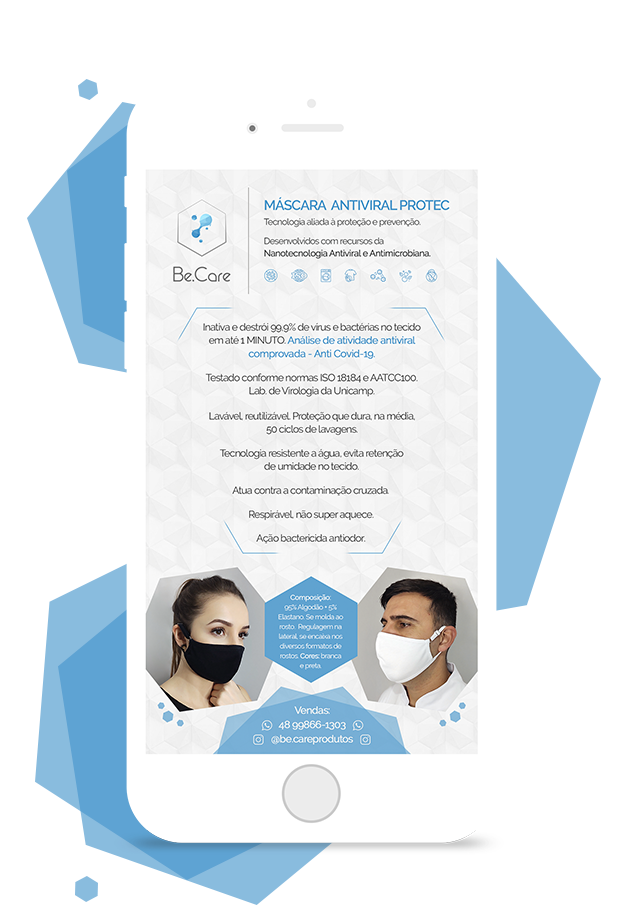
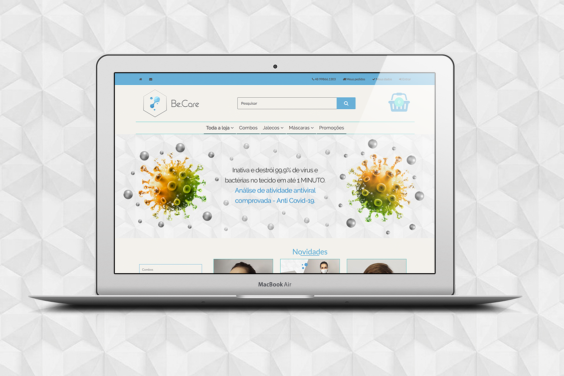
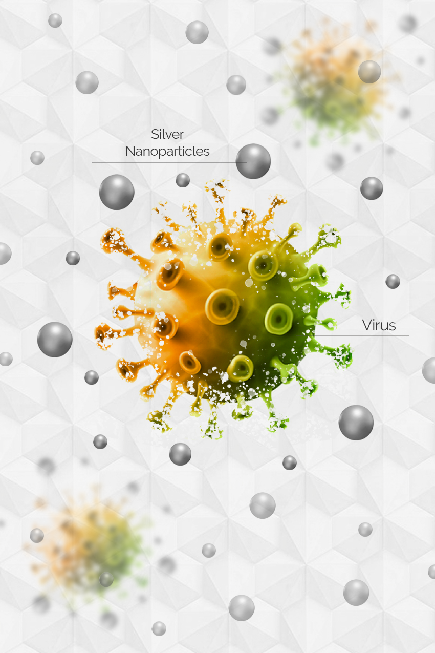
The client explained how her product uses nanotechnology, basically nanoparticles inserted into the fabric, making it both bacteria and virus proof. Considering this technology is based on atoms, the symbol used for the logo is one atom conected to the other either merging or pulling apart, and other atoms floating by around it.
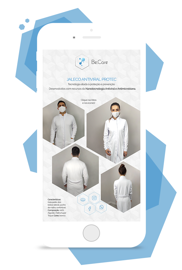
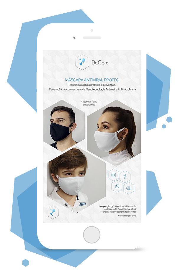
so I used it as a badge with the icon inside, on the background as a pattern with shadow cuts, and to add colour, transparent octagons for the photos to be masked inside. I presented a palette with blue tones mostly because it is associated with hospital, cleanliness, faithful and trusting, things important for materials which will be sold to protect clients from viruses and bacteria
Using the platform WBuy, I created slider banners, layouted how the products are shown, how the menu is organized, filled up info about the products, variations, sizes, edited the footer, the other pages, and social media too. So the e-commerce is complete and all products and categories are in line.
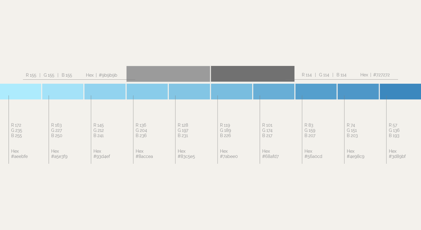
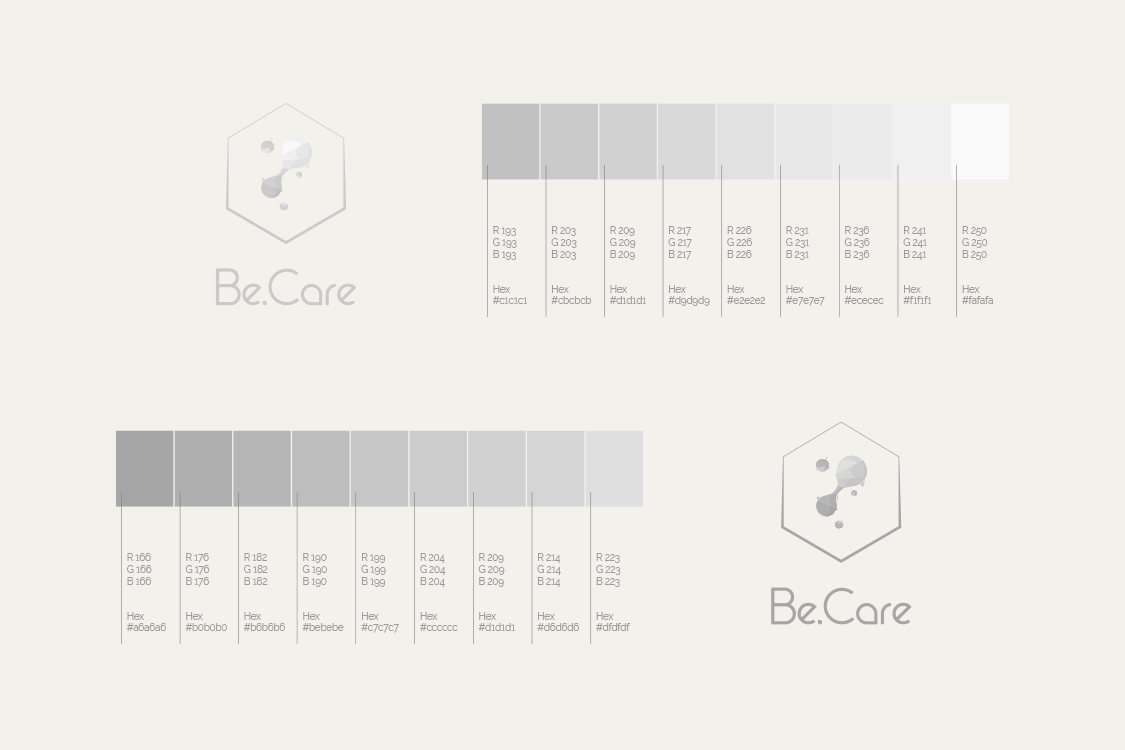
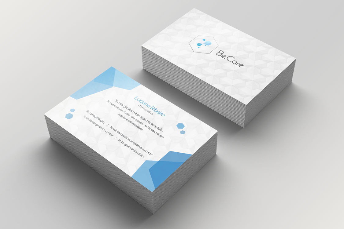
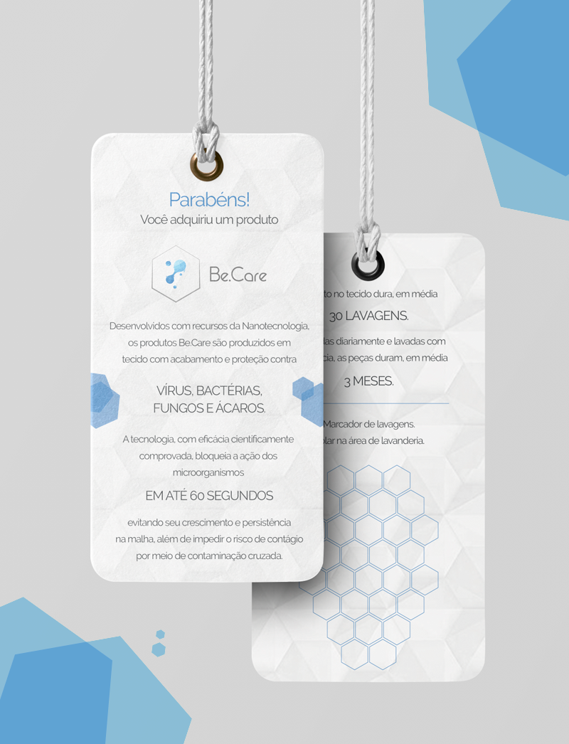
Be.Care ProductsColour palette codes, monocromatic logos, symbol only, then text only for different applications, simplified versions in dark grey and white, business card, clothing tag, website header and a post showing how the nanoparticles kill the virus and bacteria on the fabrics.