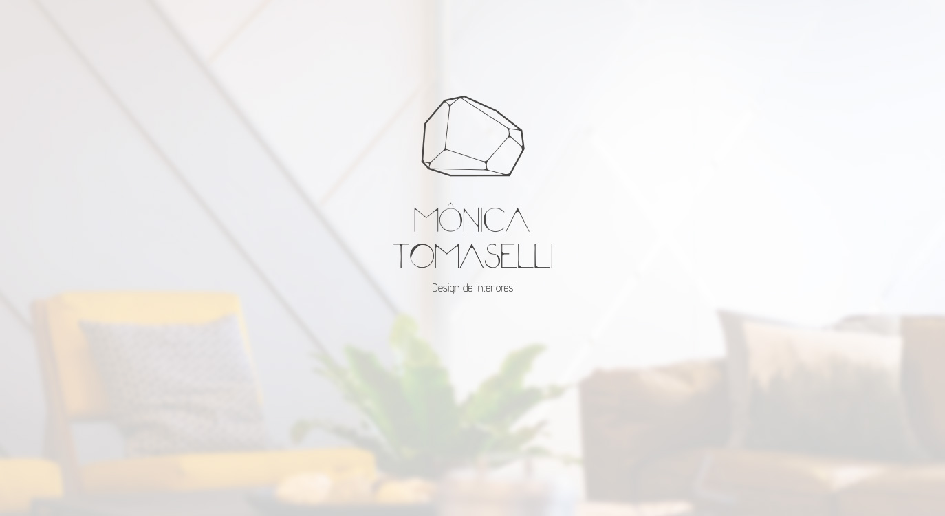
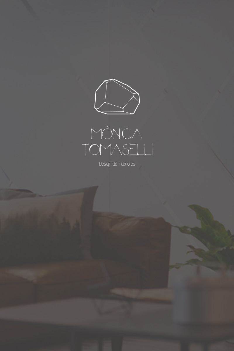
Monica Tomaselli
The client is an Interior Designer, her logo nedded an intense change. It was the same for nearly 12 years and she wanted a new, modern approach on future projects she's intended to develop.
- Branding Design
- Website
The client is an Interior Designer, her logo nedded an intense change. It was the same for nearly 12 years and she wanted a new, modern approach on future projects she's intended to develop.
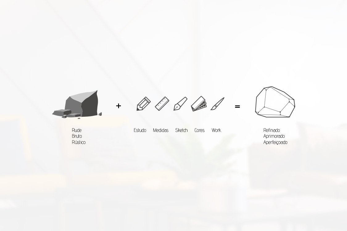
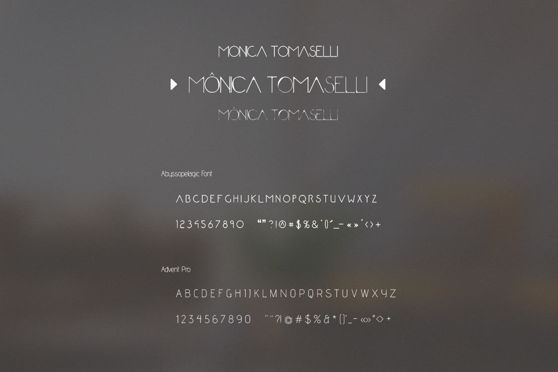
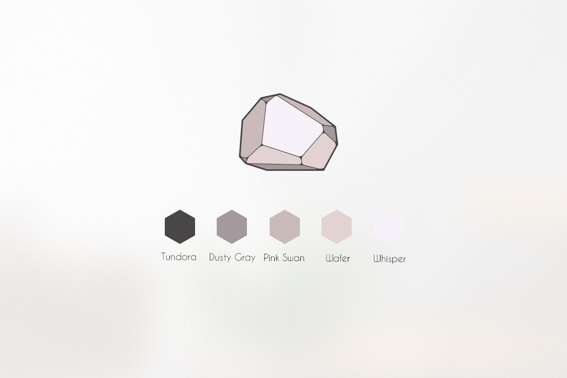
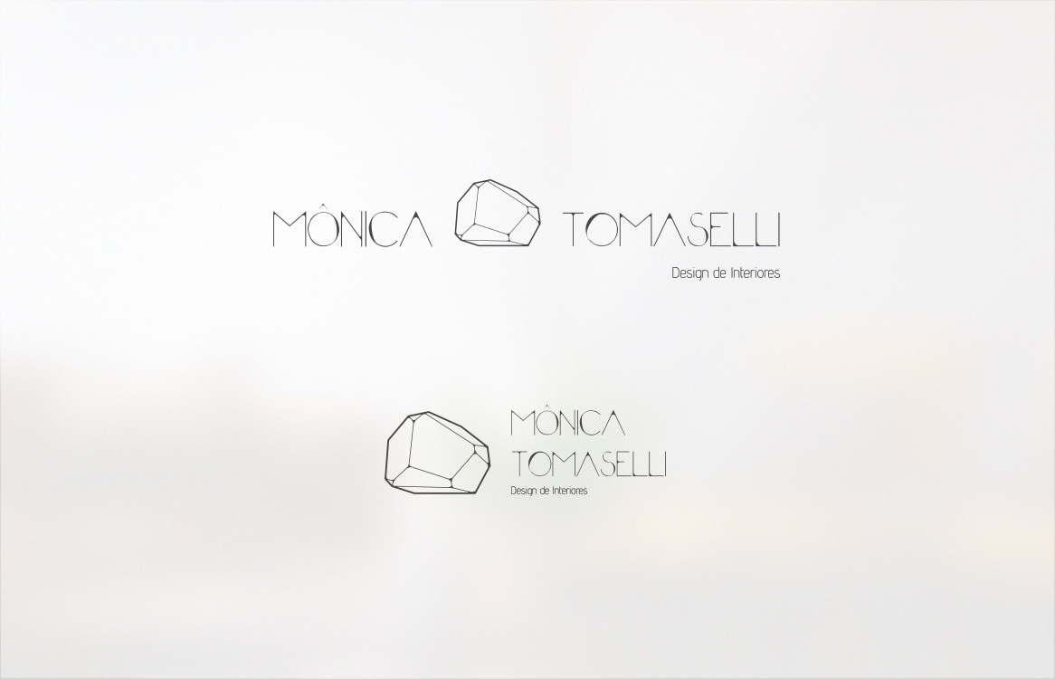
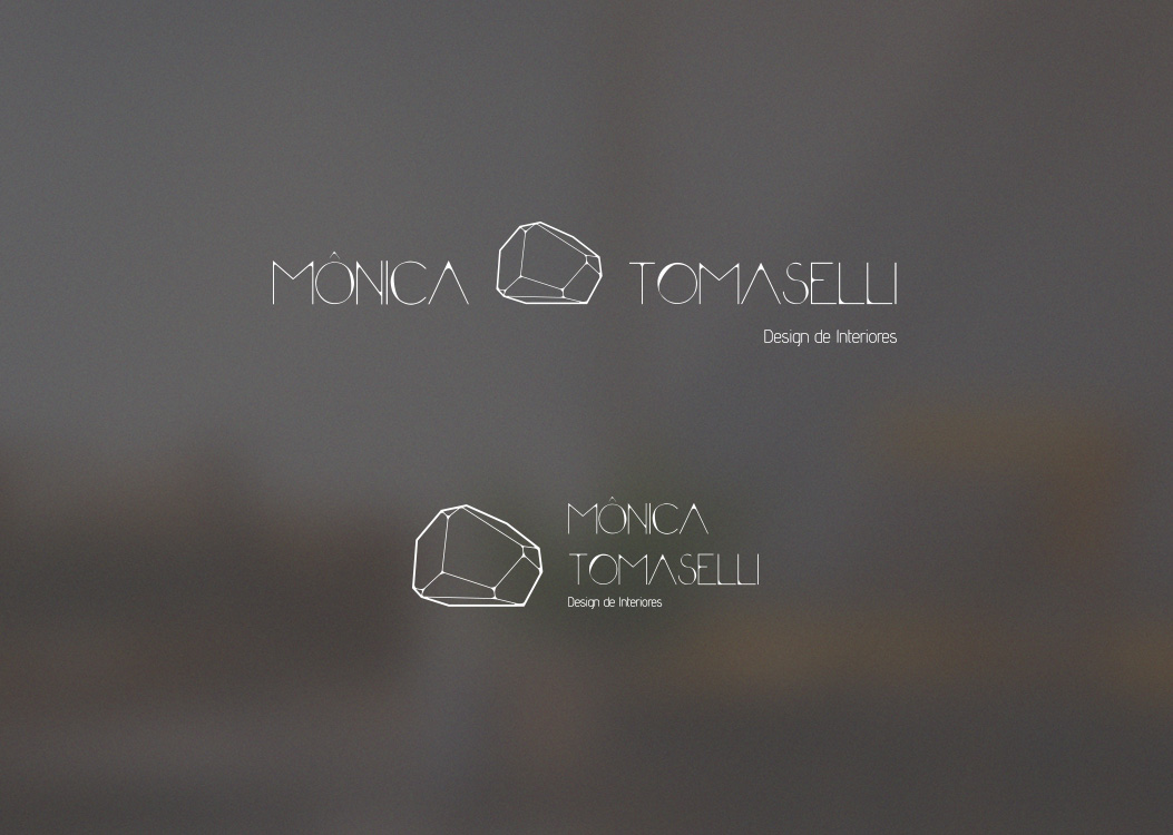
The client needed to renovate the brand's identity, so tree options were designed. She choose this one, which is a symbol that blends with the designed font. Both have round asymmetrical details on each corner, the font as well as the symbol. It's not particularly a cristal because it can be any material possible, since interior design has such a wide range of possibilities and materials to explore.
Visit Website