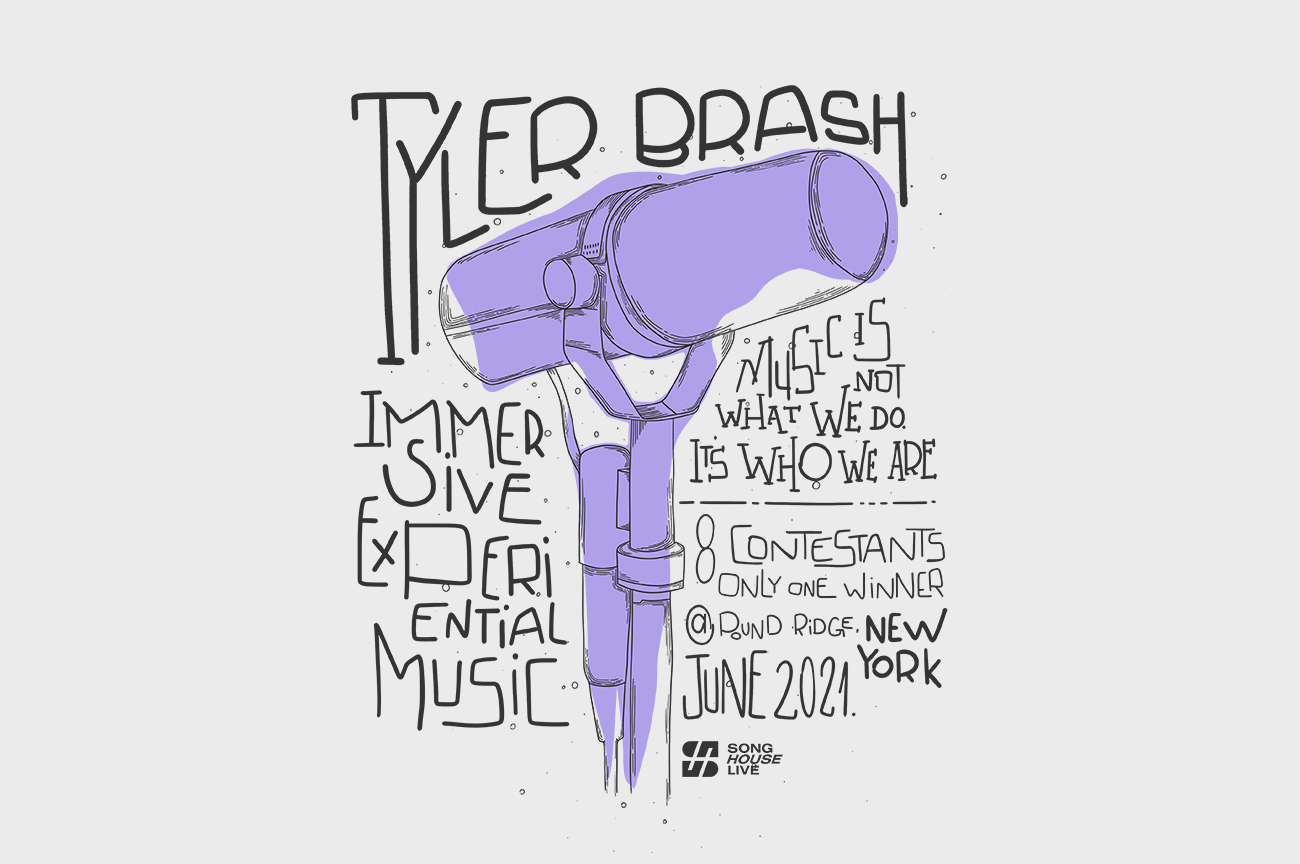

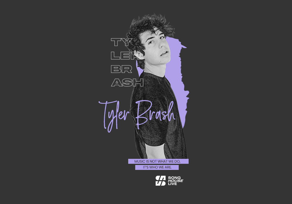
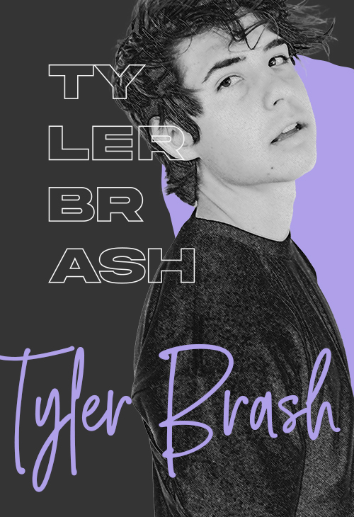
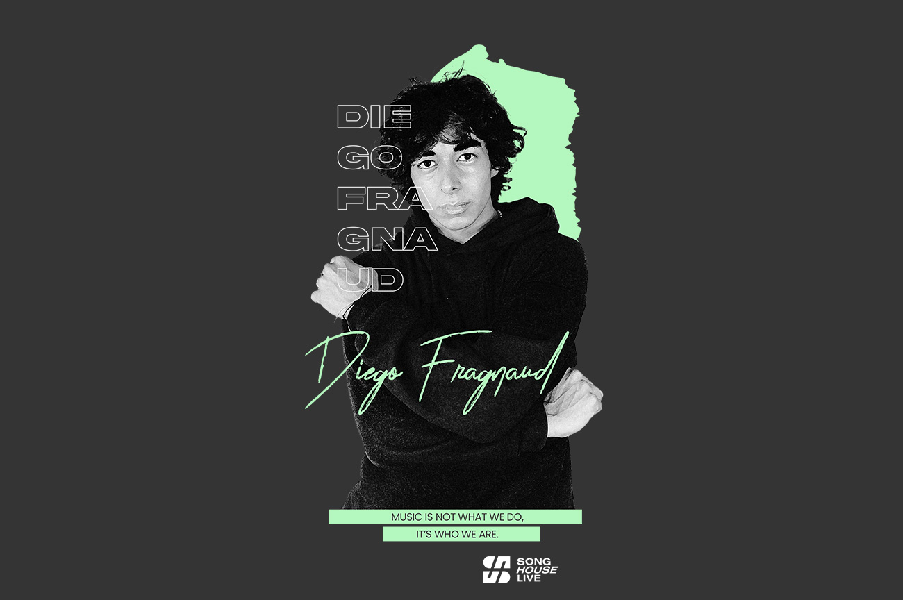
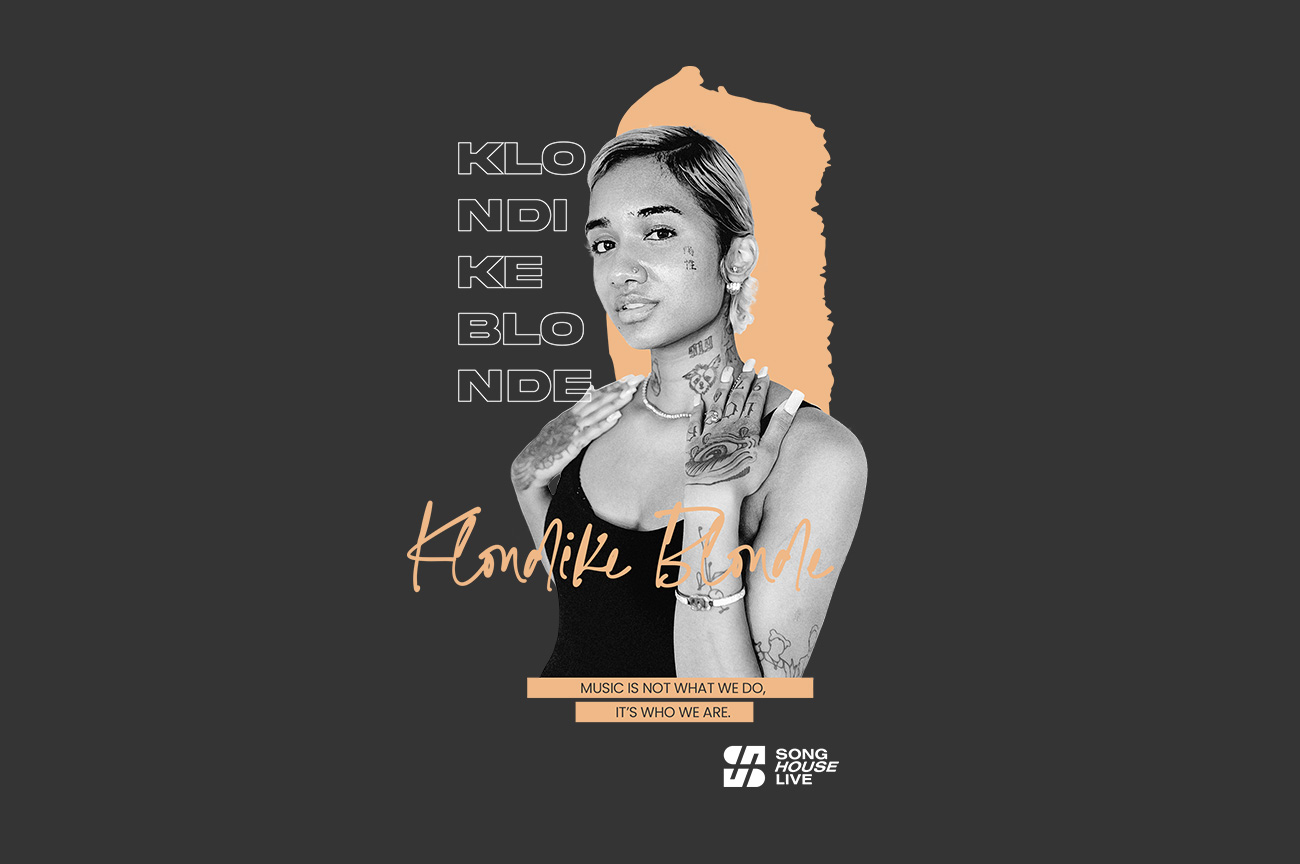
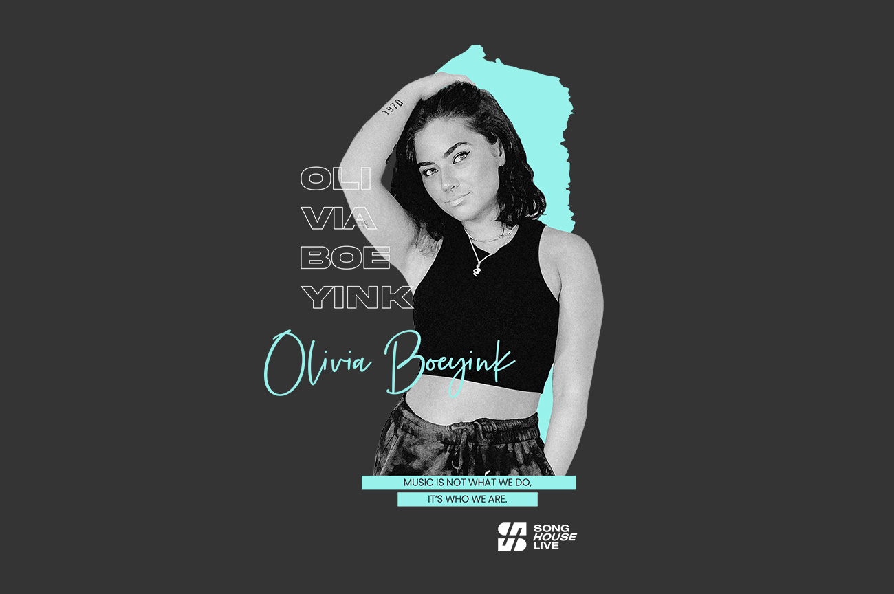
A small photo cut on the bottom, black and white with grain filter. A coloured brush representing, in this case, Tyler's merch. It will be purple so there's consistency.
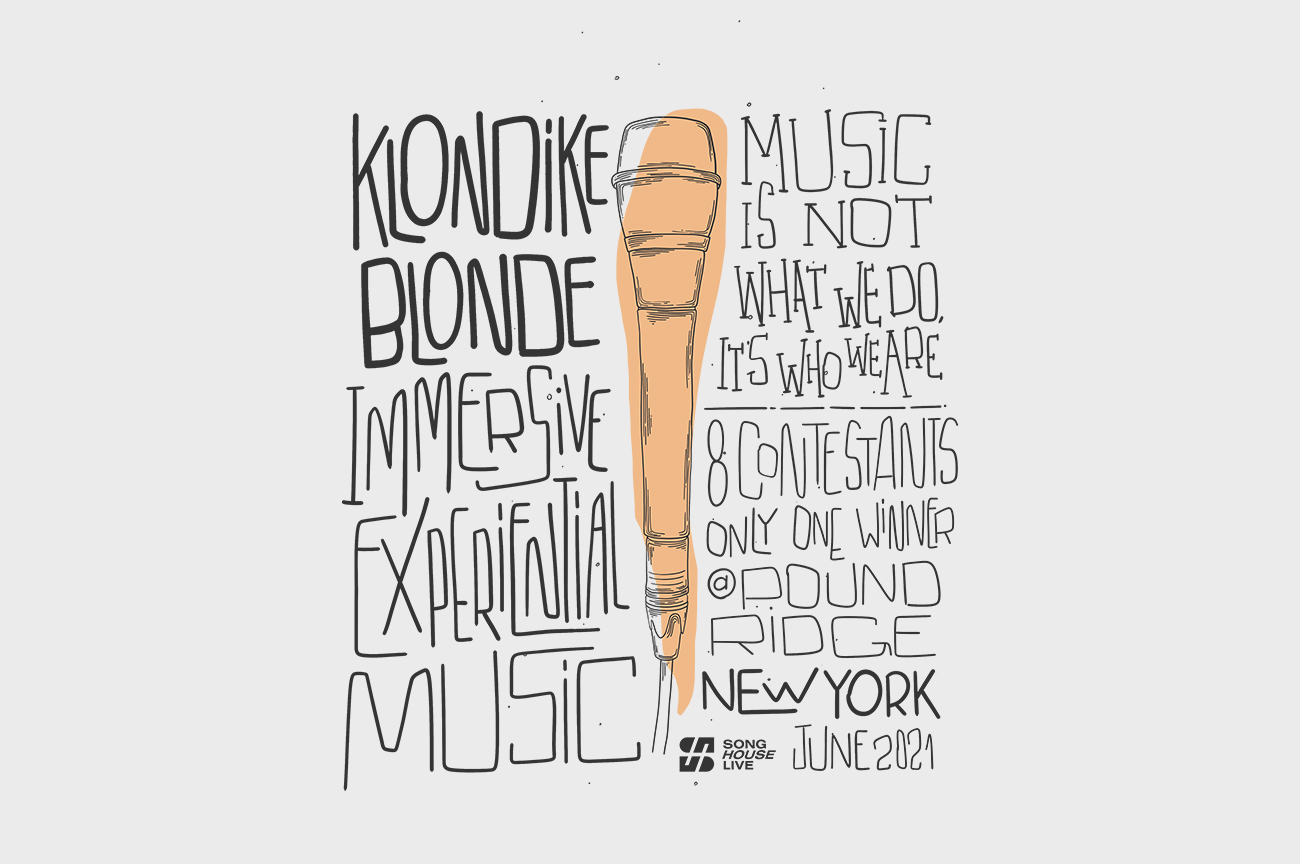
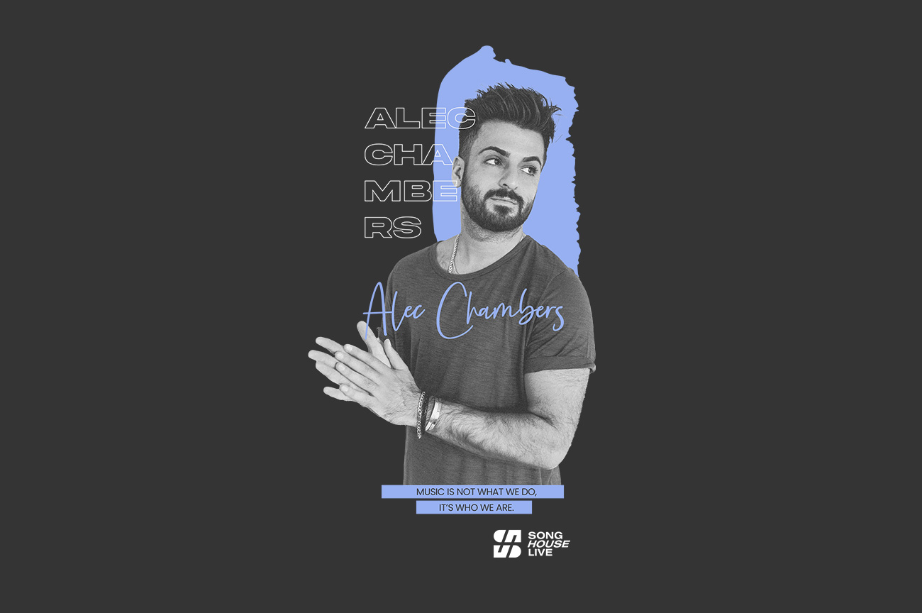
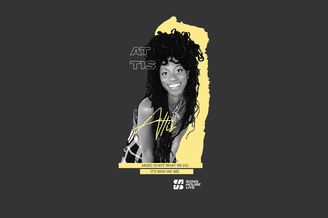
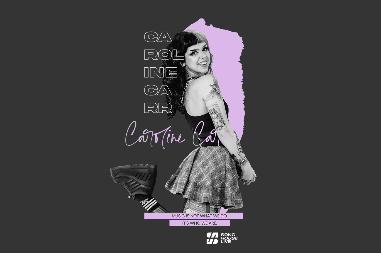
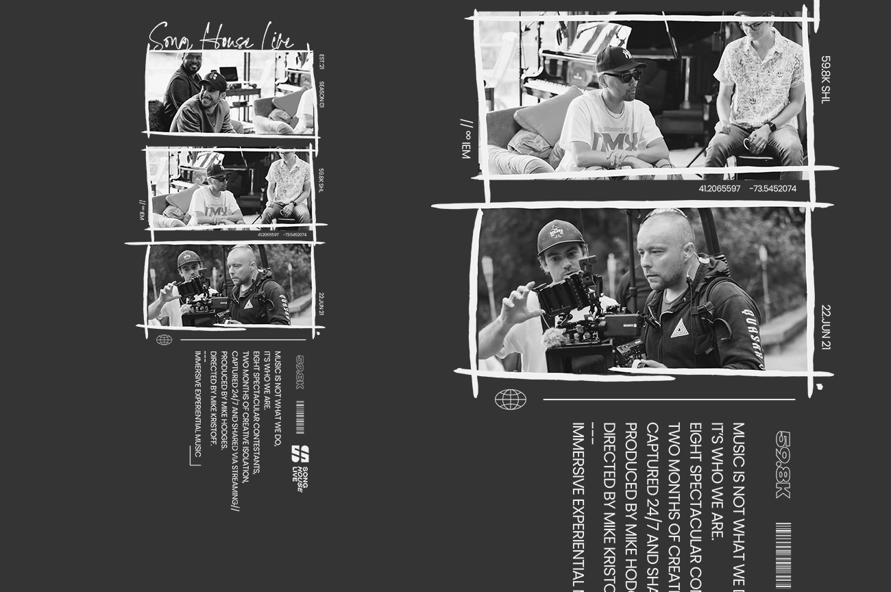
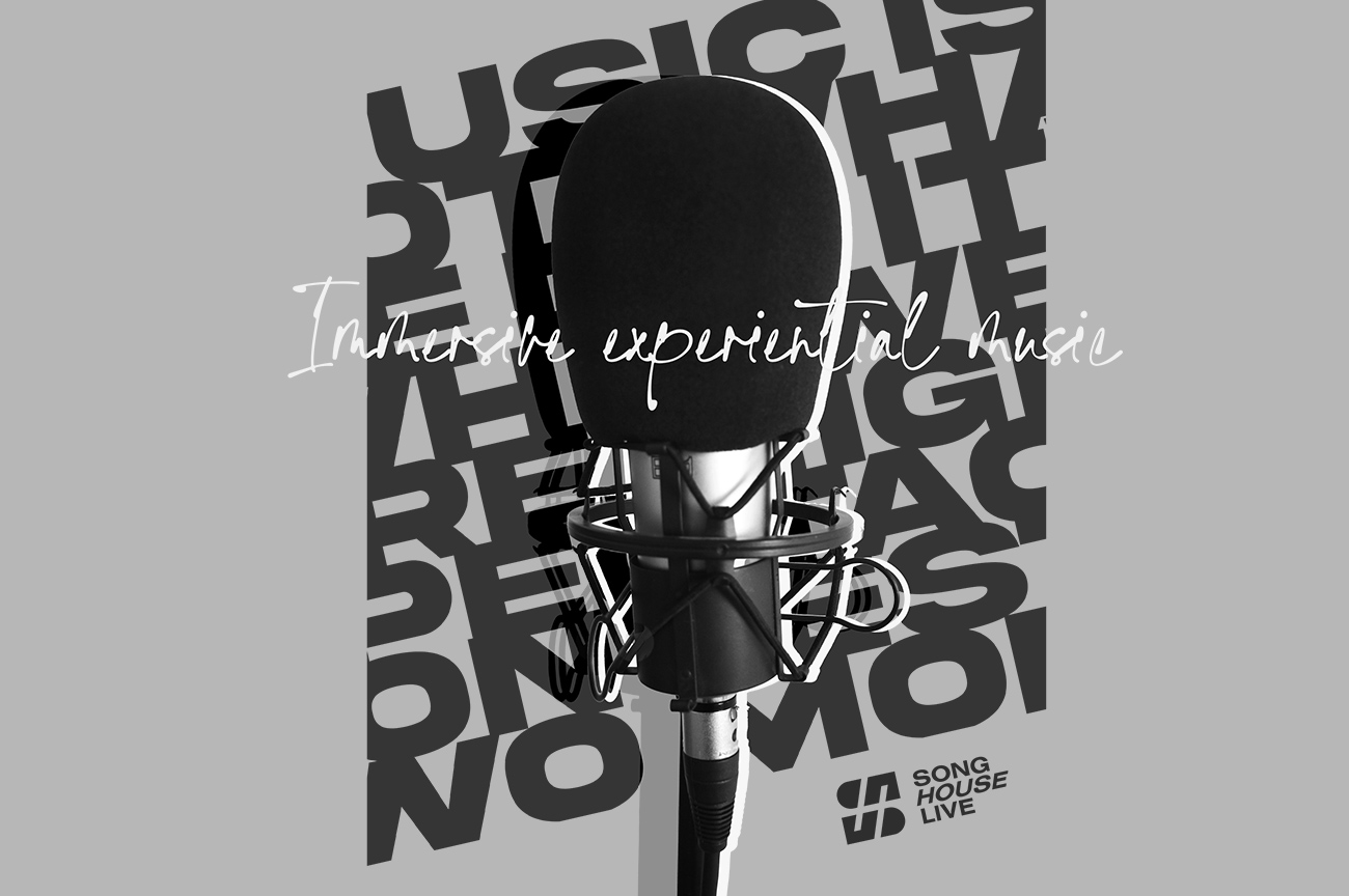
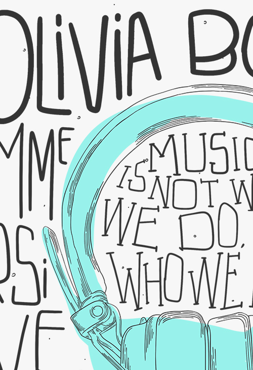
The font used for his name, with his colour, then a blocky, display font outlined slightly touches his photo. The sentence 'Music is not what we do, it's who we are' is Song House Live's motto. Then the logo to sign it.
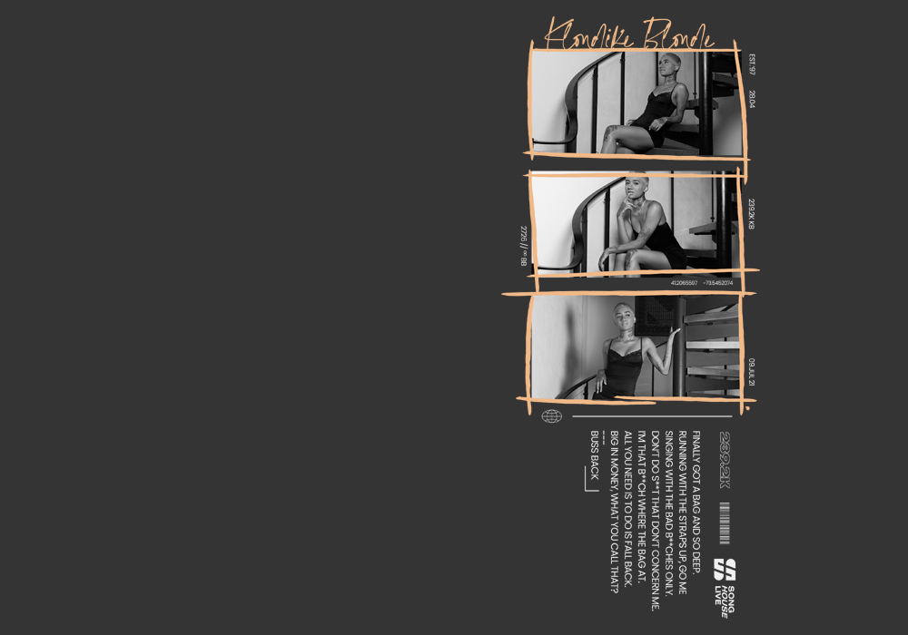
Their names above it all following colour and font style of said contestant. The info numbers/text you see surrounding it inform their follower count, number of views on their videos, date of birth, etc.
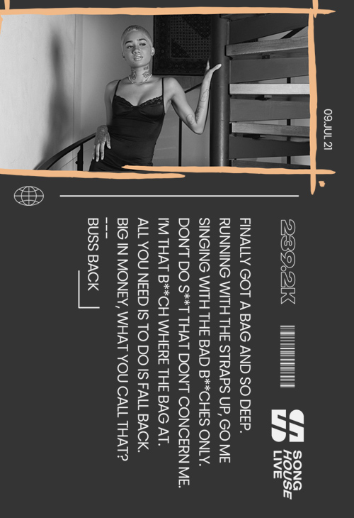
Three intimate shots of the contestants posing. Brush lines contouring said photos. Then the vertical text is the lyrics to the song they wrote. The logo signs the piece.
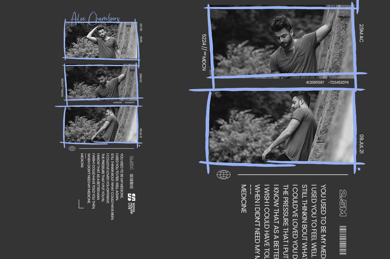
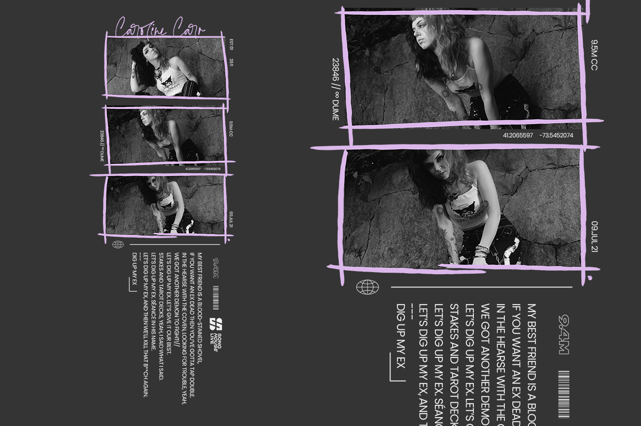
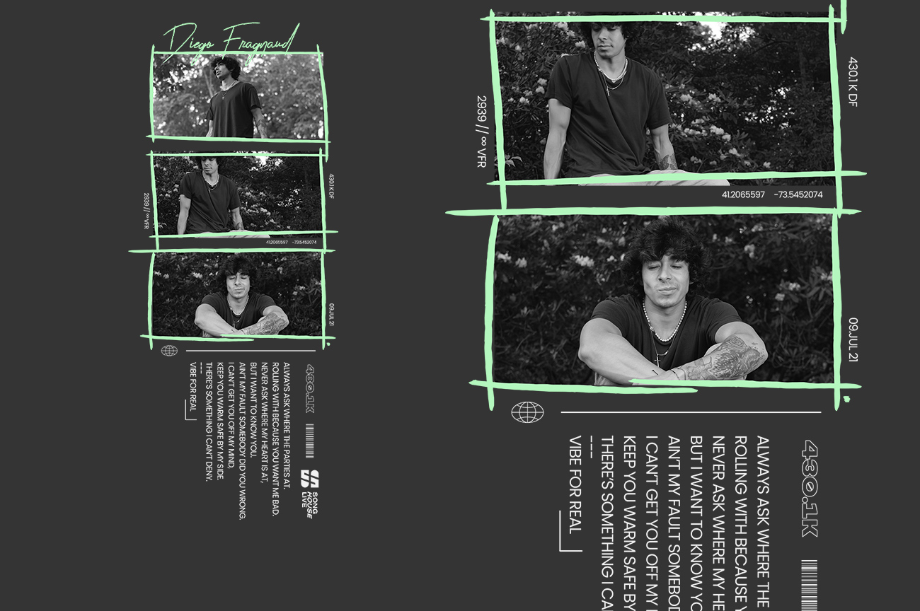
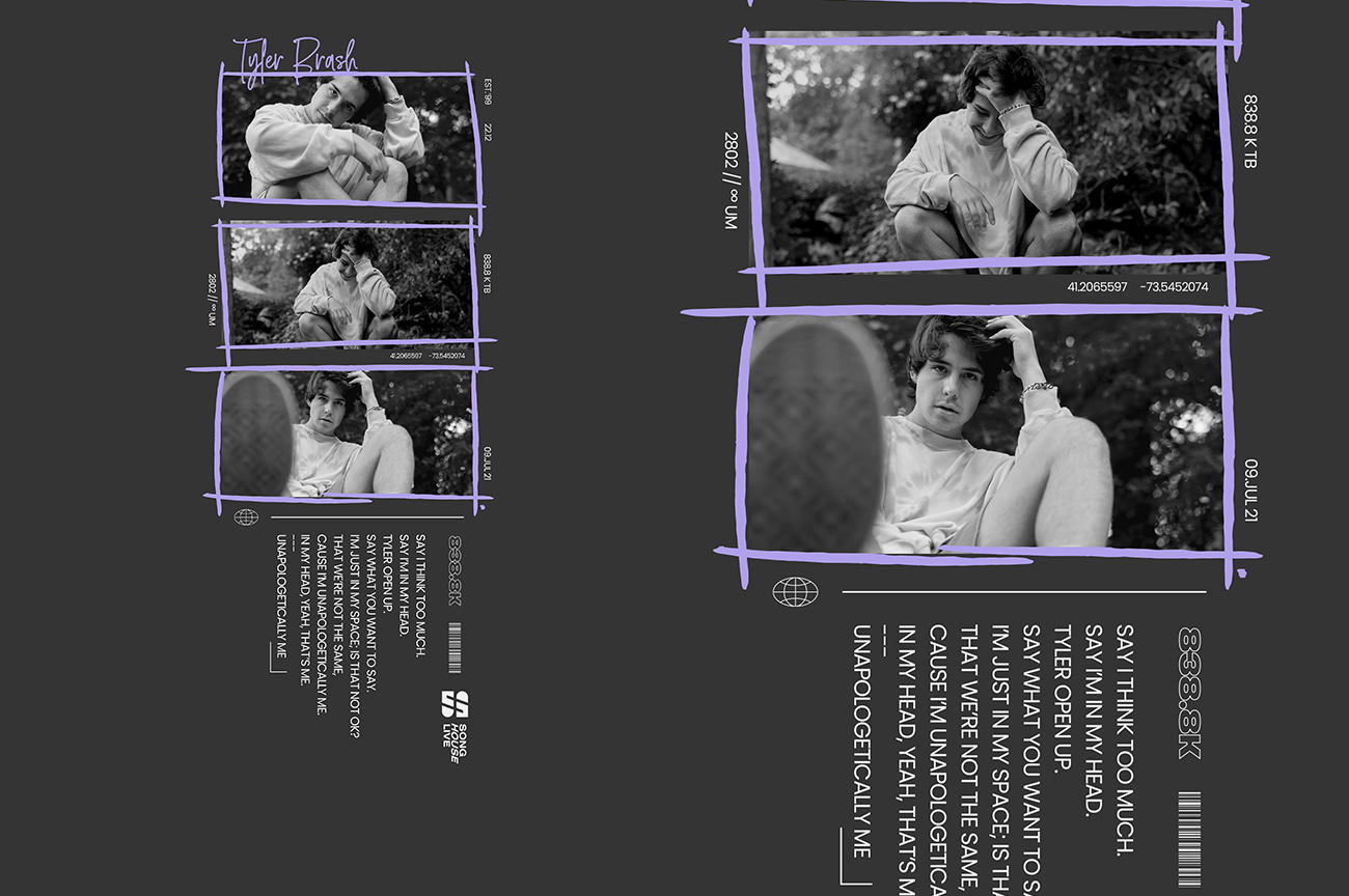
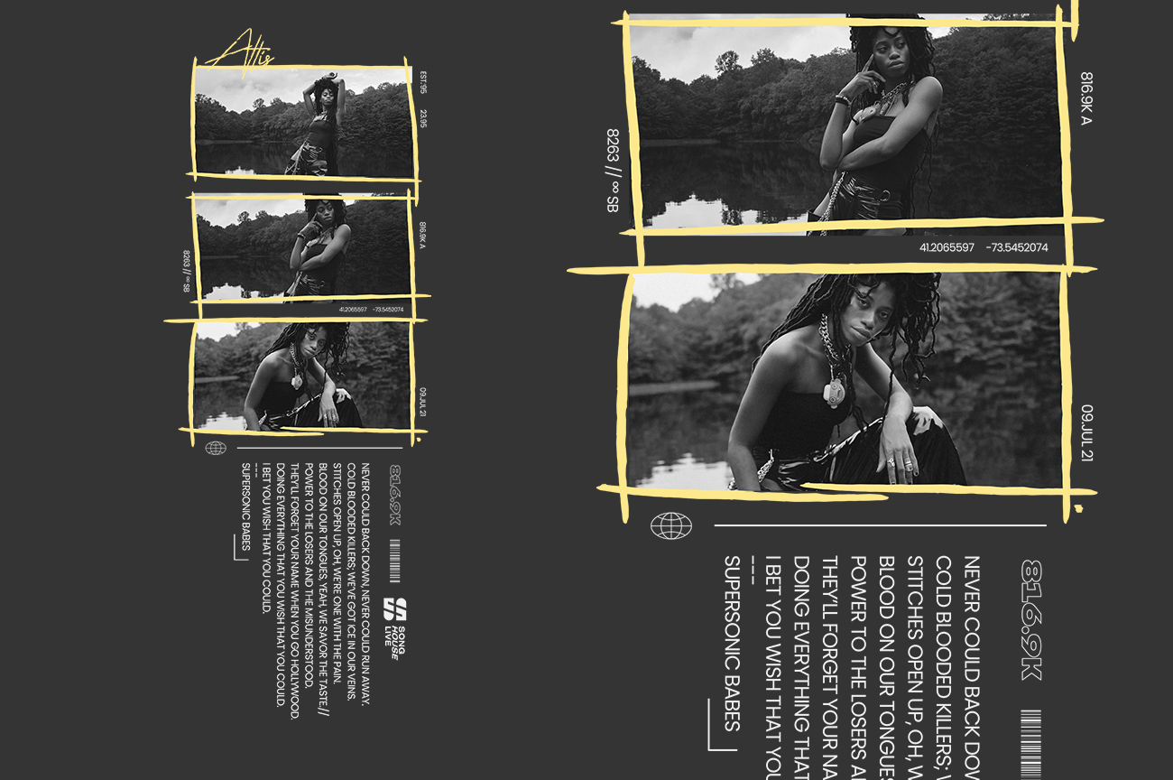
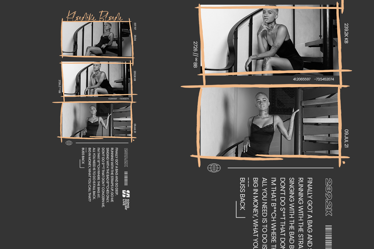
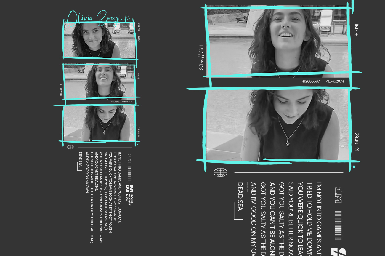
A cooler way to show their personalities, their poses and styles, the photos portray how they want to be seen, now they've been in the House for a while now.
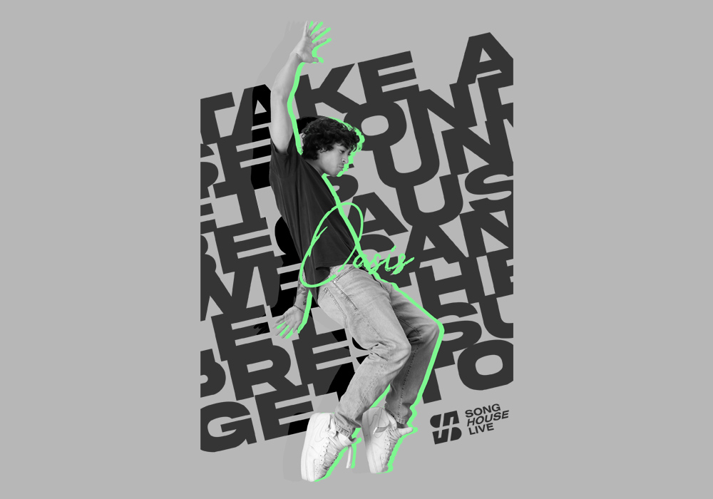
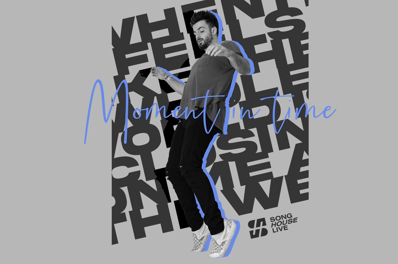
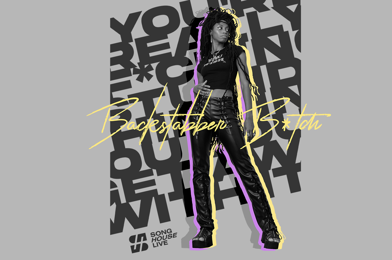
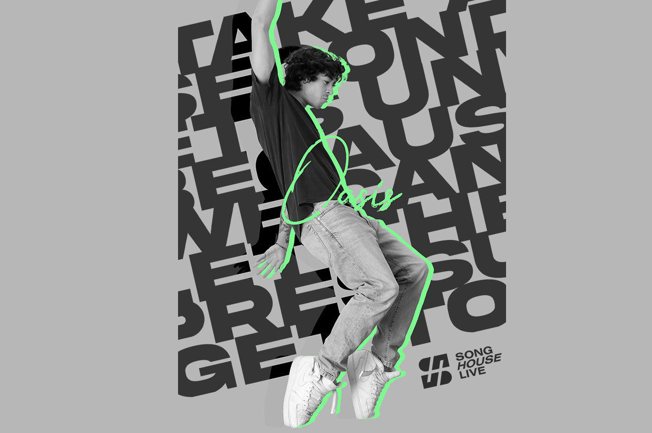
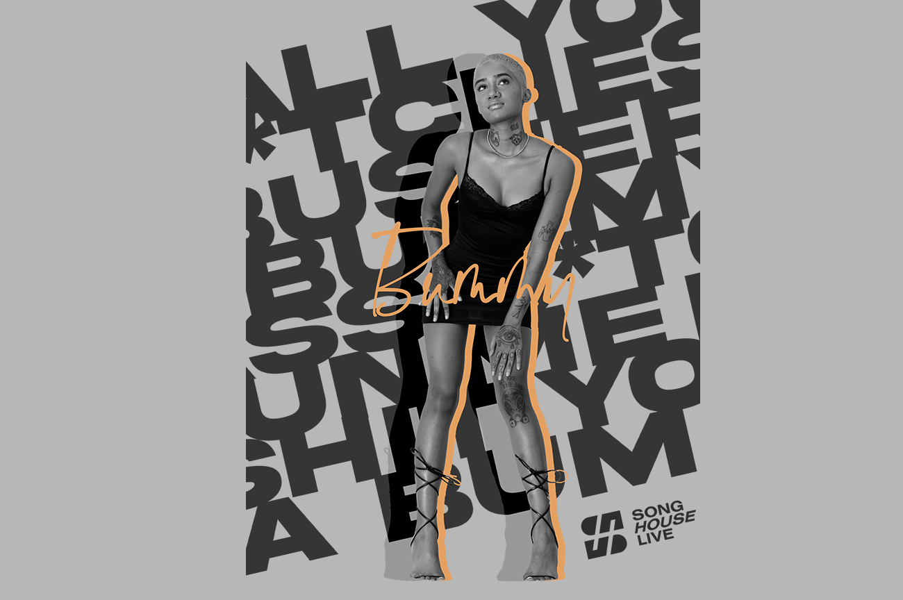
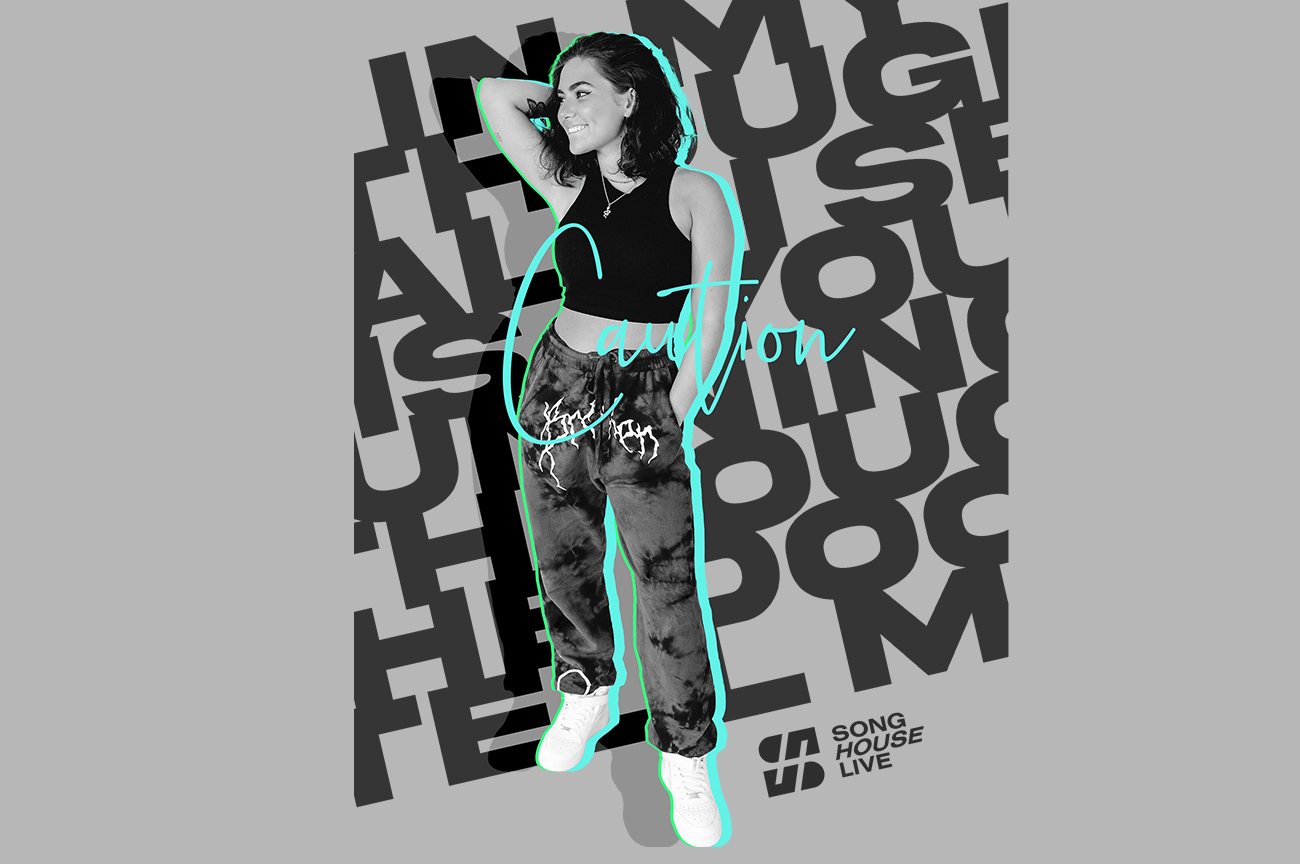
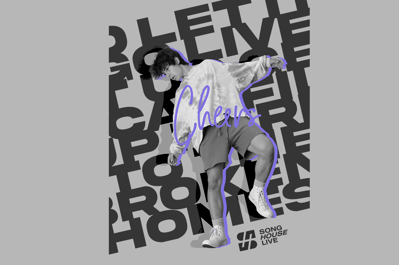
Thick fonts as a background and the title of the song over the photo, in the center. The person posing has a shadow over the font and a highlight of colour to the right. The logo signs the piece too.
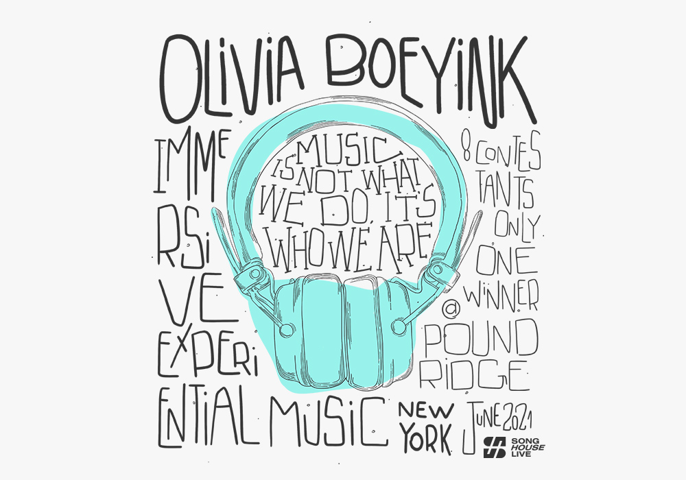
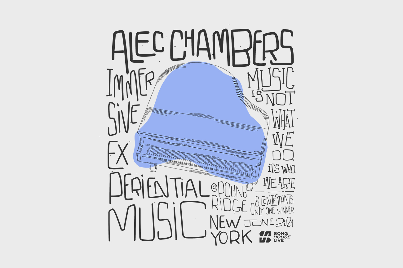
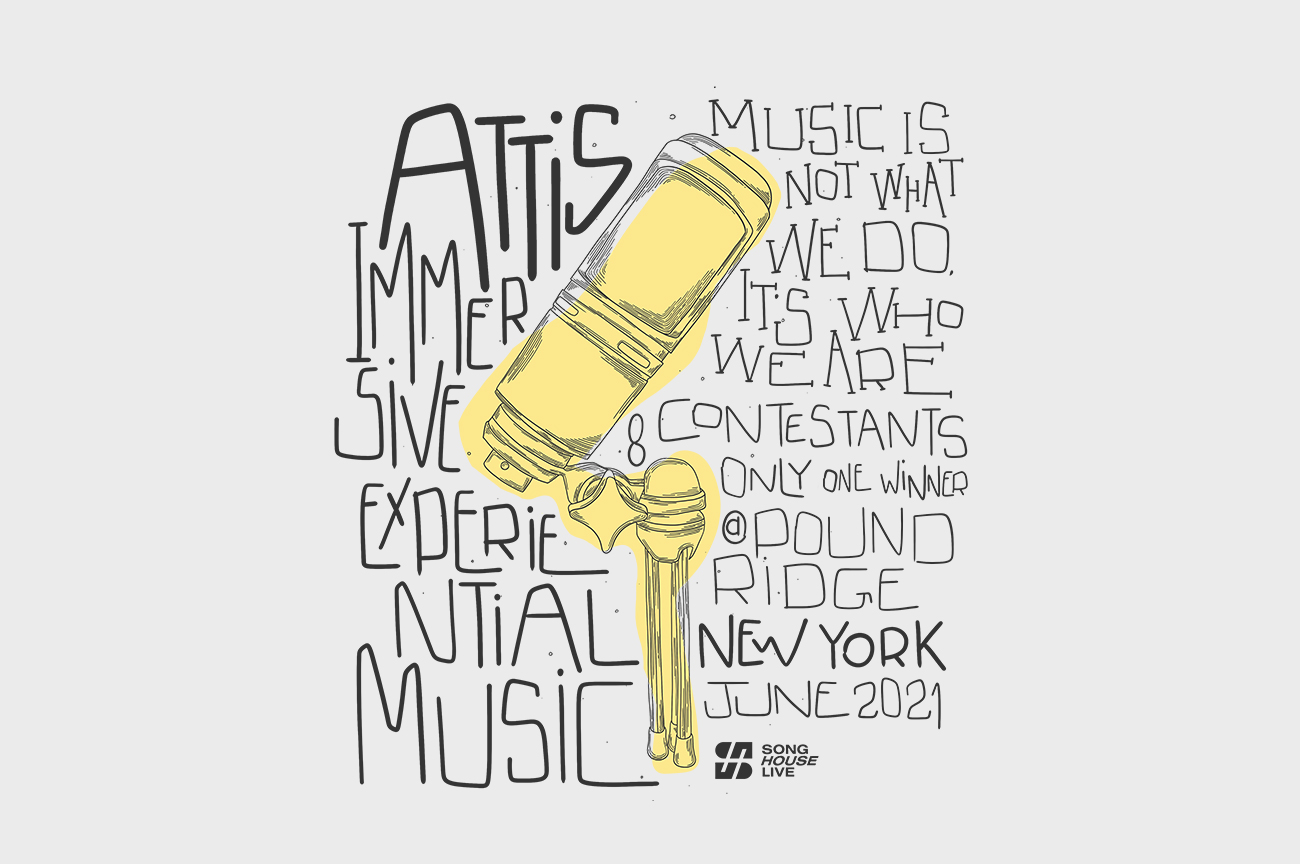
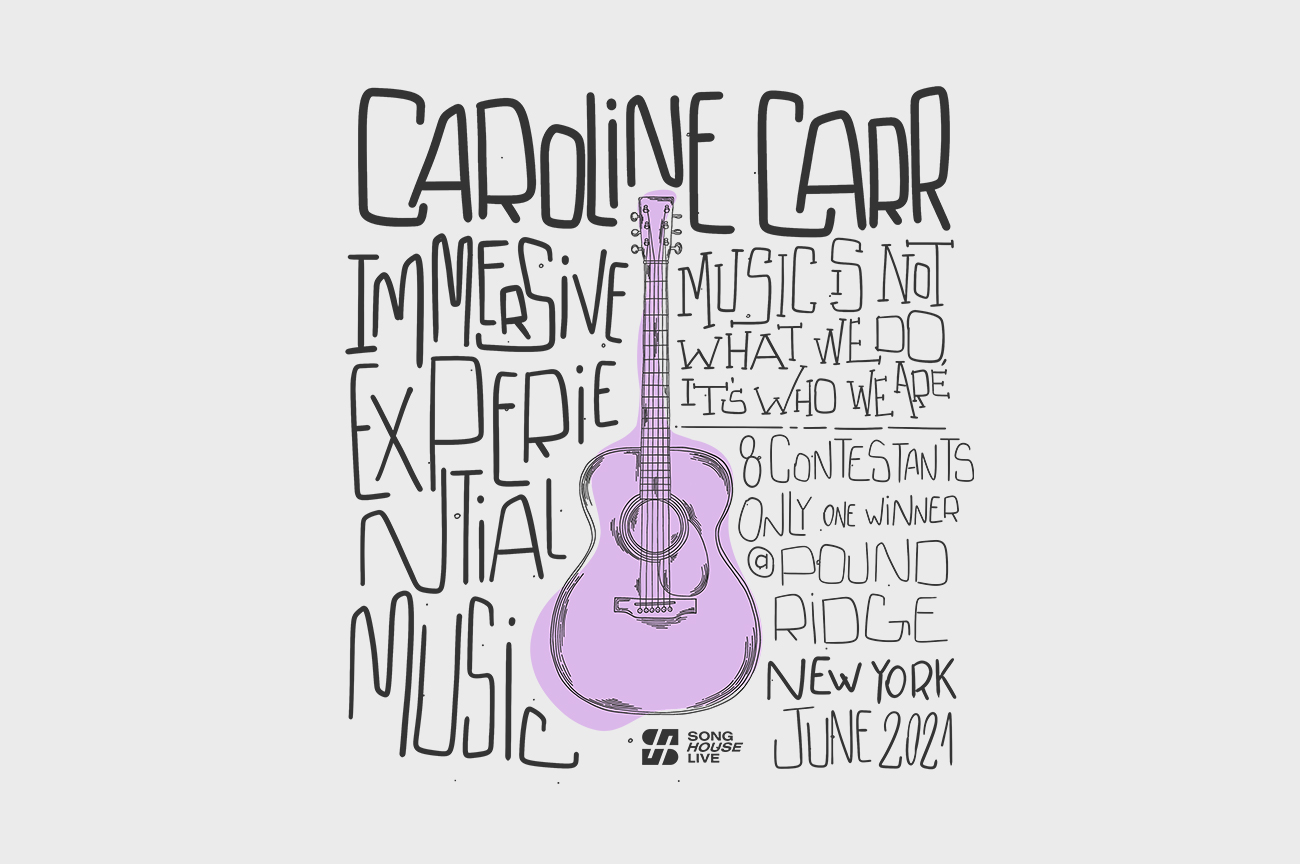
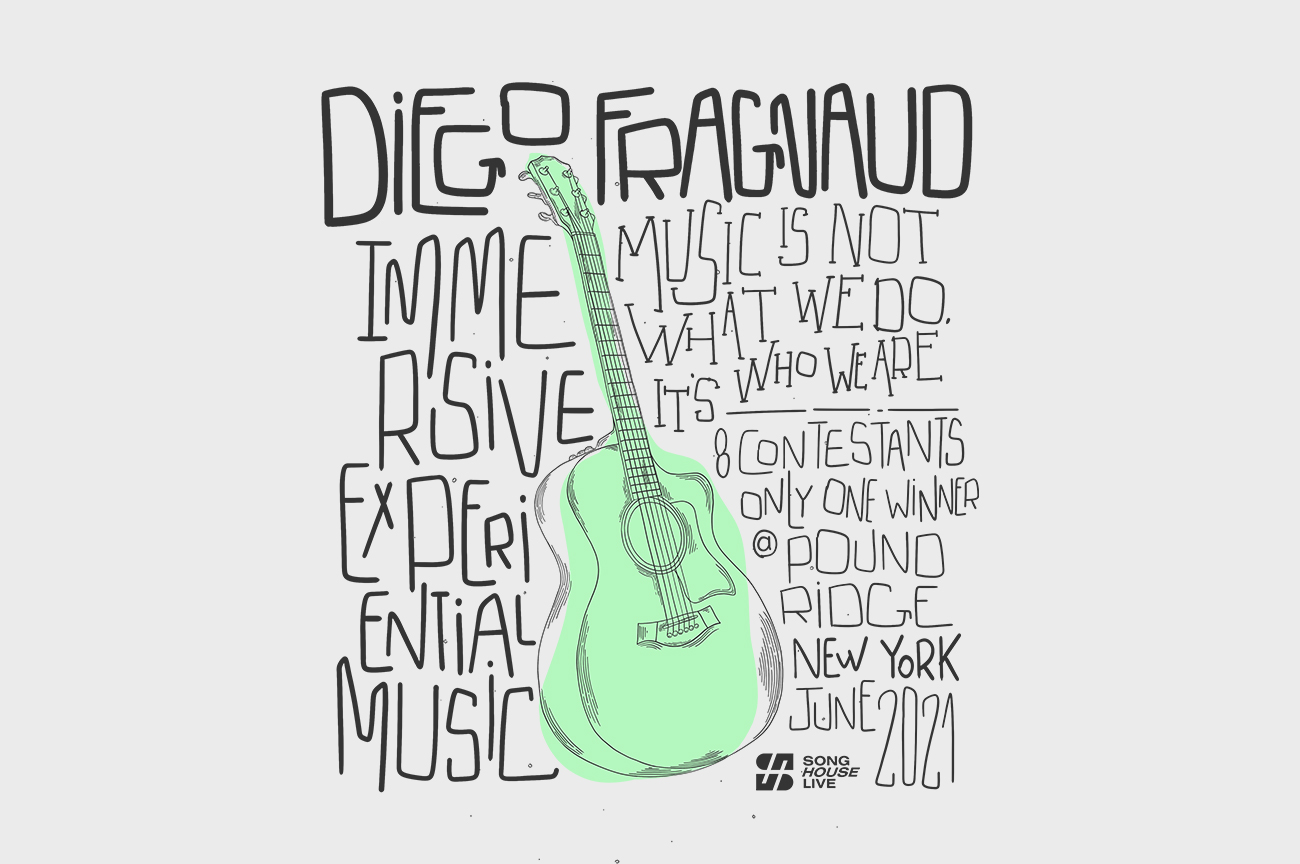
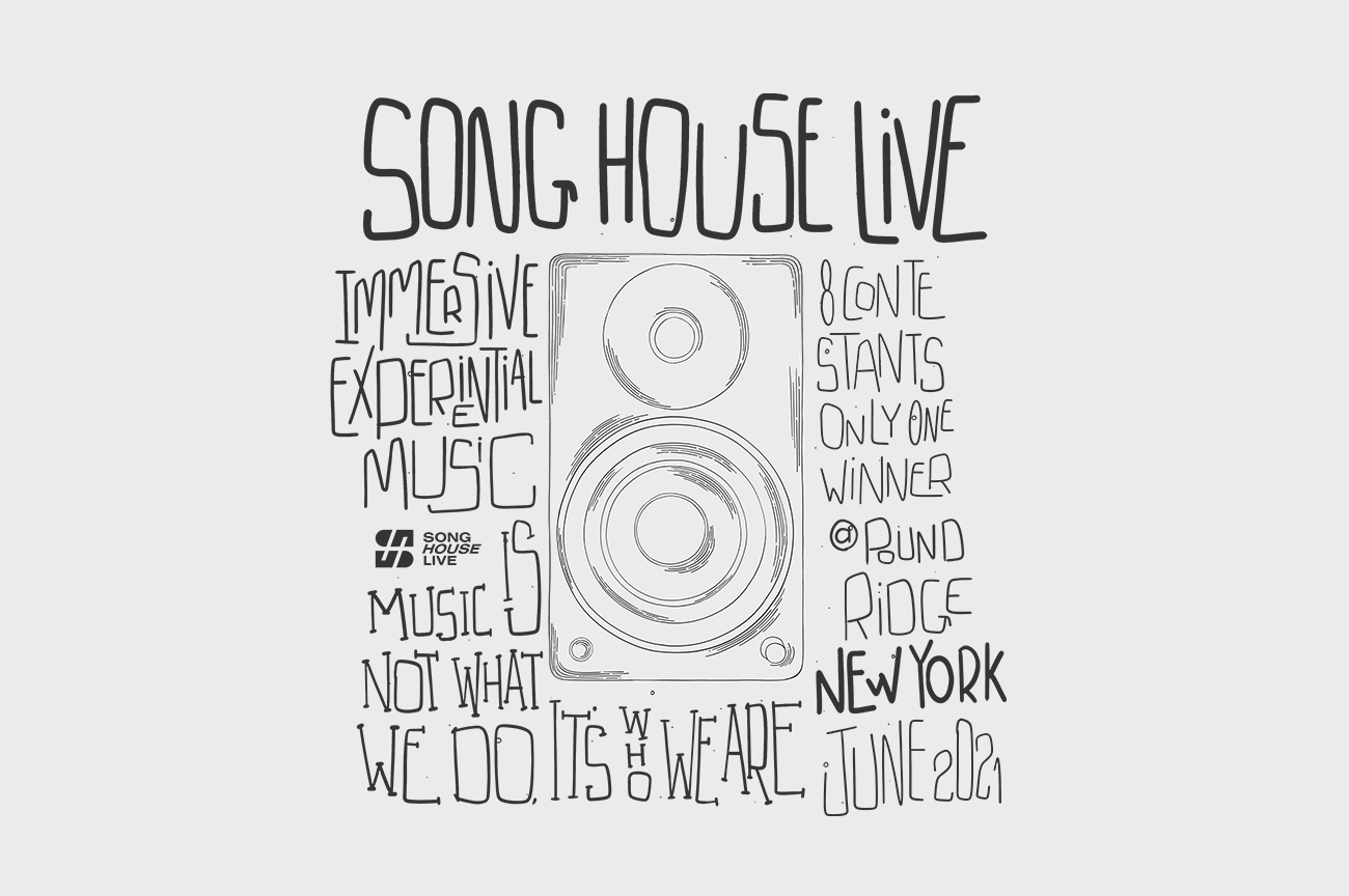
This design has an idea as if this deck is a collectible item, because it explains what the show is about, when it took place, where, and it has the House's motto telling what is is about.
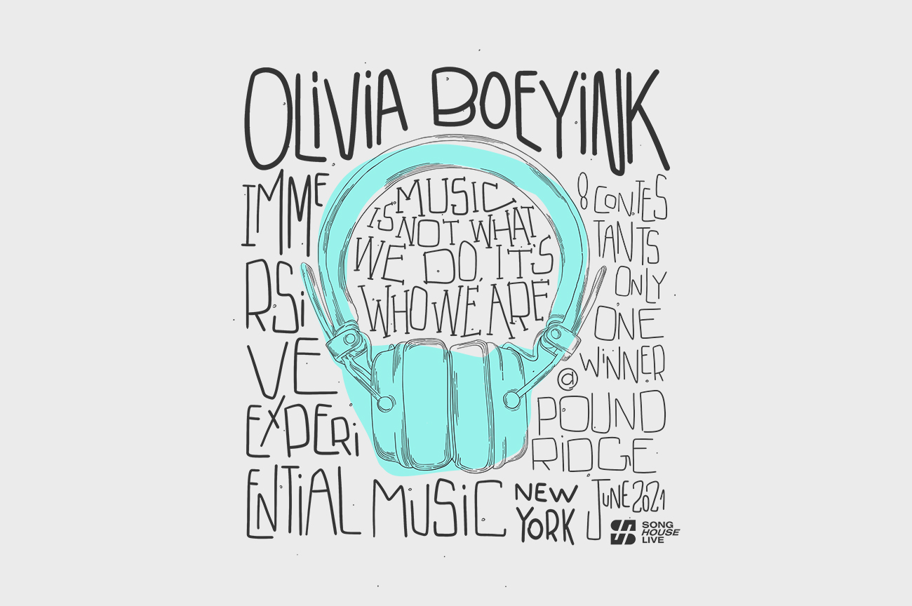
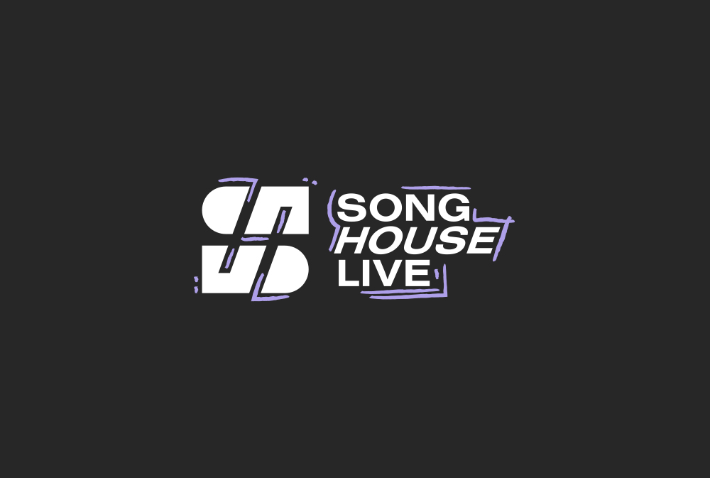
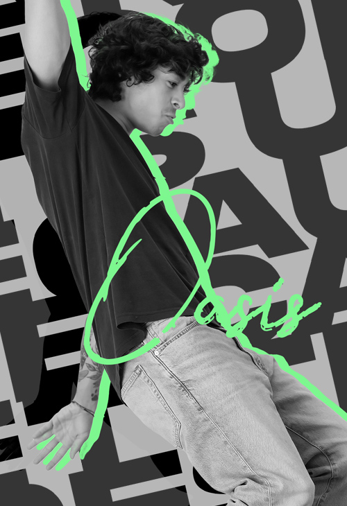
This is my personal favourite because it is very personalised, it was necessary to draw the type surrounding the illustration so each letter is different, it is totally hand drawn.